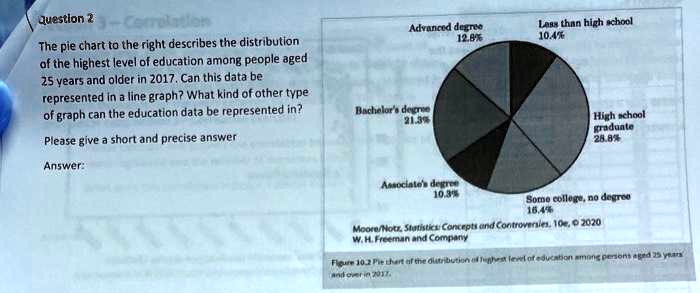
Advanced degree
12.8%
Less than high school
10.4%
Question 2
The pie chart to the right describes the distribution
of the highest level of education among people aged
25 years and older in 2017. Can this data be
represented in a line graph? What kind of other type
of graph can the education data be represented in?
Please give a short and precise answer
Answer:
Bachelor's degree
21.3%
High school
graduate
28.8%
Associate's degree
10.3%
Some college, no degree
16.4%
Moore/Notz, Statistics: Concepts and Controversies, 10e, © 2020
W. H. Freeman and Company
Figure 10.2 Pie chart of the distribution of highest level of education among persons aged 25 years
and over in 2017.