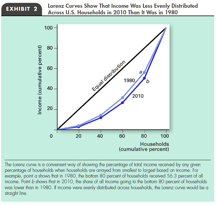
EXHIBIT 2
Lorenz Curves Show That Income Was Less Evenly Distributed
Across U.S. Households in 2010 Than It Was in 1980
Income (cumulative percent)
100
80
60
40
20
Equal distribution
a
1980
b
2010
0
20
40
60
80
100
Households
(cumulative percent)
The Lorenz curve is a convenient way of showing the percentage of total income received by any given
percentage of households when households are arrayed from smallest to largest based on income. For
example, point a shows that in 1980, the bottom 80 percent of households received 56.3 percent of all
income. Point b shows that in 2010, the share of all income going to the bottom 80 percent of households
was lower than in 1980. If income were evenly distributed across households, the Lorenz curve would be a
straight line.