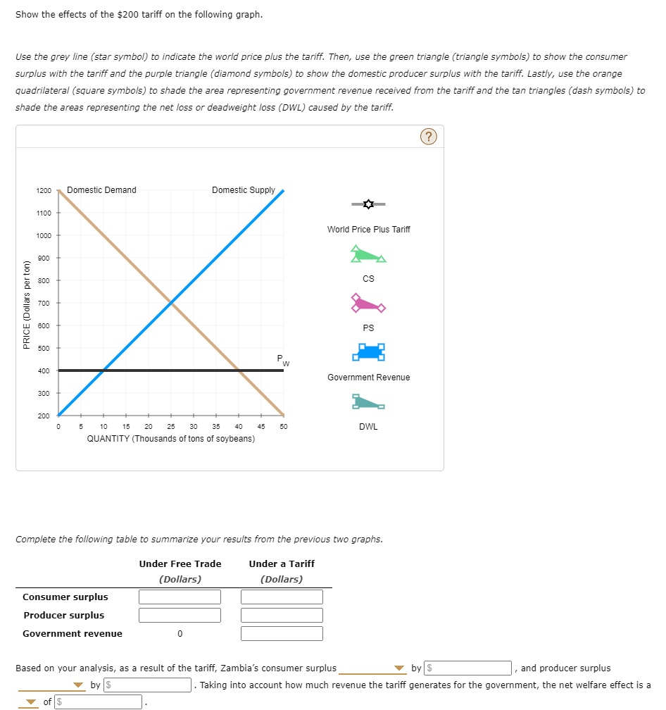
Show the effects of the $200 tariff on the following graph.
Use the grey line (star symbol) to indicate the world price plus the tariff. Then, use the green triangle (triangle symbols) to show the consumer
surplus with the tariff and the purple triangle (diamond symbols) to show the domestic producer surplus with the tariff. Lastly, use the orange
quadrilateral (square symbols) to shade the area representing government revenue received from the tariff and the tan triangles (dash symbols) to
shade the areas representing the net loss or deadweight loss (DWL) caused by the tariff.
PRICE (Dollars per ton)
1200 Domestic Demand
Domestic Supply
1100
1000
900
800
700
600
500
400
P
W
World Price Plus Tariff
CS
PS
Government Revenue
300
200
0
5
10
15 20 25 30 35 40
45
50
DWL
QUANTITY (Thousands of tons of soybeans)
Complete the following table to summarize your results from the previous two graphs.
Under Free Trade
(Dollars)
Under a Tariff
(Dollars)
Consumer surplus
Producer surplus
Government revenue
0
Based on your analysis, as a result of the tariff, Zambia's consumer surplus
by $
and producer surplus
of $
by $
Taking into account how much revenue the tariff generates for the government, the net welfare effect is a