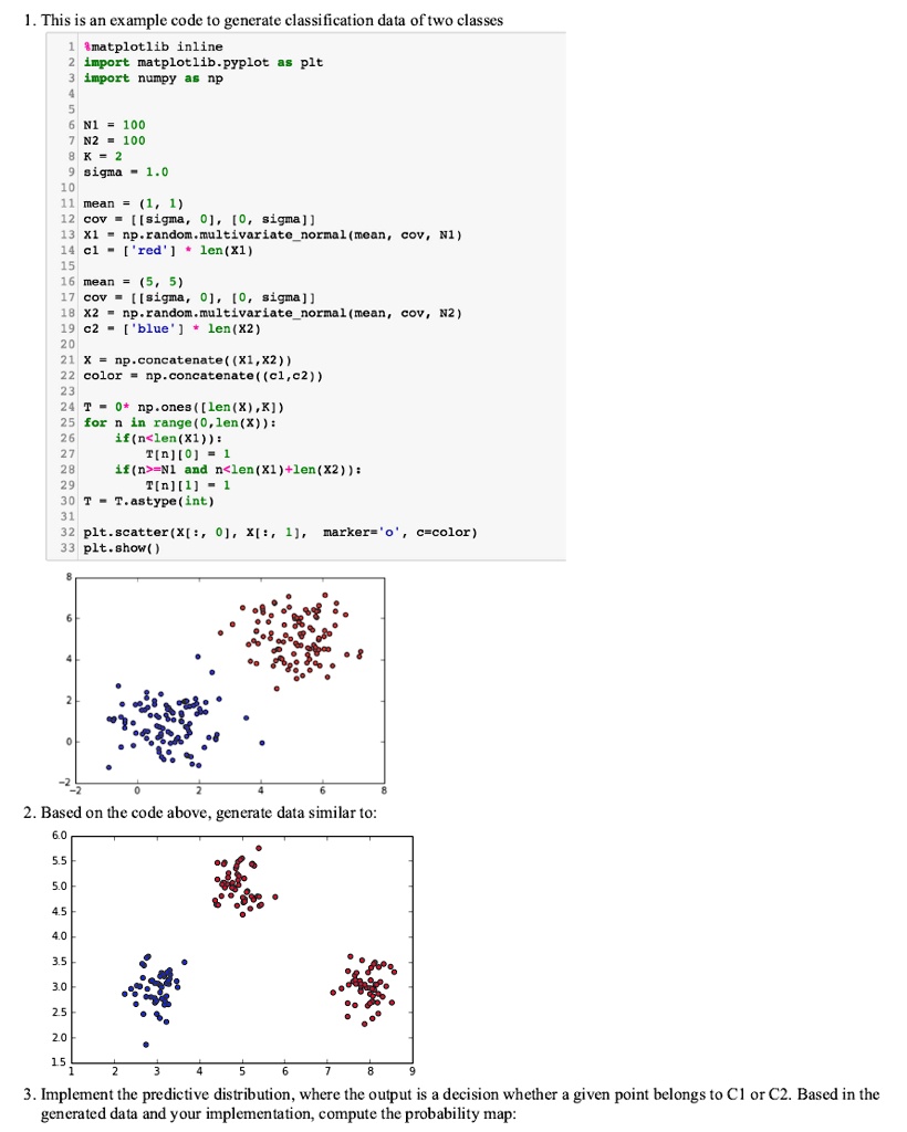
1. This is an example code to generate classification data of two classes
1 matplotlib inline
2 import matplotlib.pyplot as plt
3 import numpy as np
4
5
6 N1 = 100
7 N2 = 100
8 K = 2
9 sigma = 1.0
10
11 mean = (1, 1)
12 cov = [[sigma, 0], [0, sigma]]
13 X1 = np.random.multivariate_normal(mean, cov, N1)
14 cl = ['red'] * len(X1)
15
16 mean = (5, 5)
17 cov = [[sigma, 0], [0, sigma]]
18 X2 = np.random.multivariate_normal(mean, cov, N2)
19 c2 = ['blue'] * len(X2)
20
21 X = np.concatenate((X1, X2))
22 color = np.concatenate((cl, c2))
23
24 T = np.ones([len(X), K])
25 for n in range(0, len(X)):
26 if(n < len(X1)):
27 T[n][0] = 1
28 if (n >= N1 and n < len(X1) + len(X2)):
29 T[n][1] = 1
30 T = T.astype(int)
31
32 plt.scatter(X[:, 0], X[:, 1], marker='o', c=color)
33 plt.show()
2. Based on the code above, generate data similar to:
3. Implement the predictive distribution, where the output is a decision whether a given point belongs to C1 or C2. Based in the
generated data and your implementation, compute the probability map: