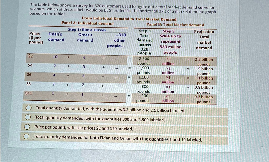
The table below shows a survey for 320 customers used to figure out a total market demand curve for
peanuts. Which of these labels would be BEST suited for the horizontal axis of a market demand graph
based on the table?
From Individual Demand to Total Market Demand
Panel A: Individual demand
Price:
Fidan's
($ per
pound)
demand
Step 1: Run a survey
Omar's
demand
...318
other
people...
Panel B: Total Market demand
Step 2
Total
demand
Step 3
Scale up to
represent
320 million
people
Projection
Total
market
demand
$2
10
+
6
+
=
2,500
pounds
×1
million
=
2.5 billion
pounds
$4
7
+
5
+
=
1,900
pounds
×1
million
=
1.9 billion
pounds
$6
4
+
3
+
=
1,100
pounds
×1
million
=
1.1 billion
pounds
$8
3
+
2
+
=
800
pounds
×1
million
=
0.8 billion
pounds
$10
1
+
1
+
=
300
pounds
×1
million
=
0.3 billion
pounds
Total quantity demanded, with the quantities 0.3 billion and 2.5 billion labeled.
Total quantity demanded, with the quantities 300 and 2,500 labeled.
Price per pound, with the prices $2 and $10 labeled.
Total quantity demanded for both Fidan and Omar, with the quantities 1 and 10 labeled.