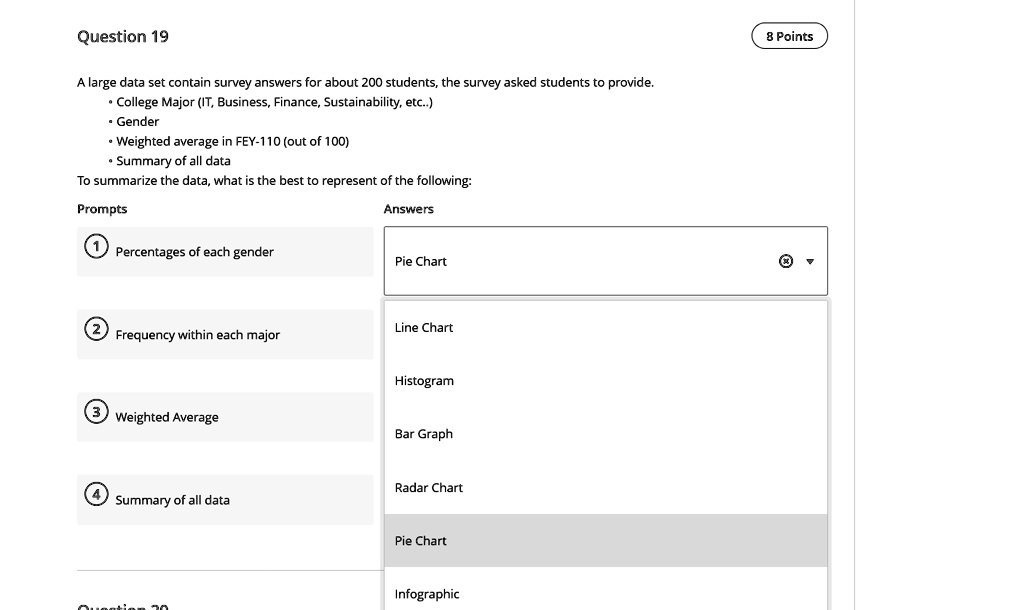
Question 19
A large data set contain survey answers for about 200 students, the survey asked students to provide.
• College Major (IT, Business, Finance, Sustainability, etc..)
• Gender
• Weighted average in FEY-110 (out of 100)
• Summary of all data
To summarize the data, what is the best to represent of the following:
Prompts
Percentages of each gender
Answers
Pie Chart
Line Chart
Frequency within each major
Weighted Average
Histogram
Bar Graph
Radar Chart
Summary of all data
Pie Chart
Infographic
8 Points