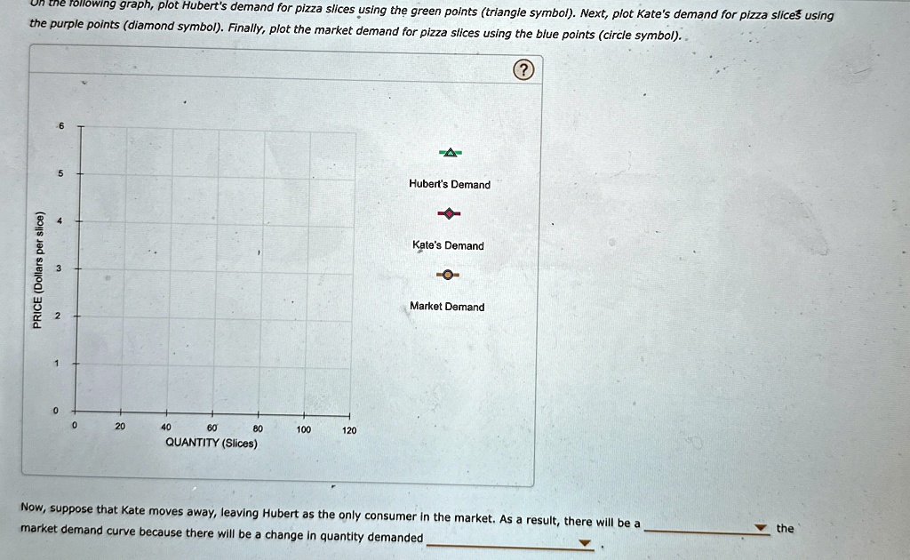
On the following graph, plot Hubert's demand for pizza slices using the green points (triangle symbol). Next, plot Kate's demand for pizza slices using the purple points (diamond symbol). Finally, plot the market demand for pizza slices using the blue points (circle symbol).
PRICE (Dollars per slice)
QUANTITY (Slices)
Hubert's Demand
Kate's Demand
Market Demand
Now, suppose that Kate moves away, leaving Hubert as the only consumer in the market. As a result, there will be a market demand curve because there will be a change in quantity demanded