9. The Laffer curve
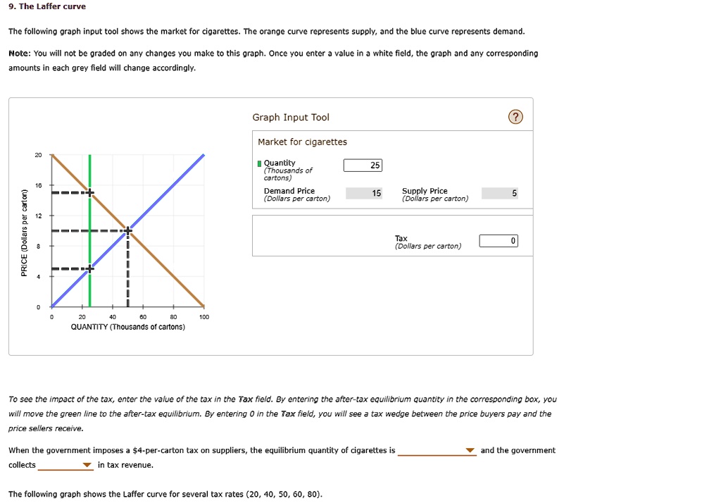
The following graph input tool shows the market for cigarettes. The orange curve represents supply, and the blue curve represents demand.
Note: You will not be graded on any changes you make to this graph. Once you enter a value in a white field, the graph and any corresponding
amounts in each grey field will change accordingly.
PRICE (Dollars per carton)
20
16
12
8
4
0
0
20
40
60
80
100
QUANTITY (Thousands of cartons)
Graph Input Tool
Market for cigarettes
?Quantity
(Thousands of
25
cartons)
Demand Price
(Dollars per carton)
15
Supply Price
(Dollars per carton)
5
Tax
0
(Dollars per carton)
To see the impact of the tax, enter the value of the tax in the Tax field. By entering the after-tax equilibrium quantity in the corresponding box, you
will move the green line to the after-tax equilibrium. By entering 0 in the Tax field, you will see a tax wedge between the price buyers pay and the
price sellers receive.
When the government imposes a $4-per-carton tax on suppliers, the equilibrium quantity of cigarettes is
collects
? in tax revenue.
? and the government
The following graph shows the Laffer curve for several tax rates (20, 40, 50, 60, 80).