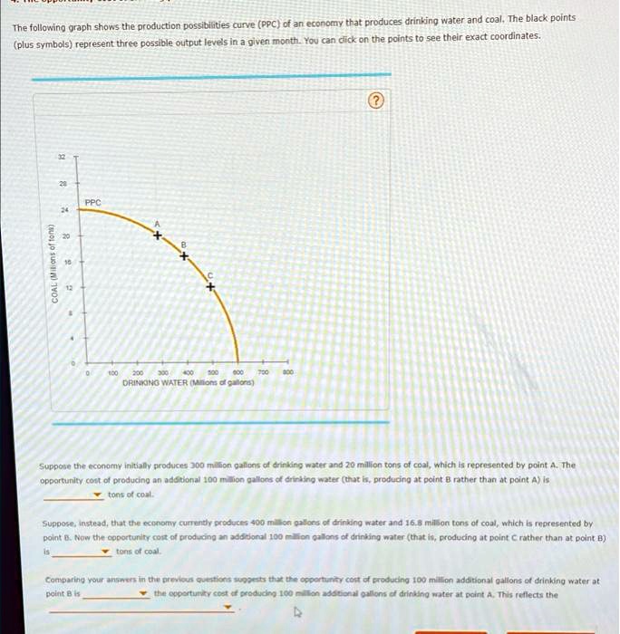
The following graph shows the production possibilities curve (PPC) of an economy that produces drinking water and coal. The black points
(plus symbols) represent three possible output levels in a given month. You can click on the points to see their exact coordinates.
COAL (Milions of tons)
32
28
24
PPC
A
+
B
+
C
+
400
500 600 700 800
200 300
DRINKING WATER (Millions of gallons)
Suppose the economy initially produces 300 million gallons of drinking water and 20 million tons of coal, which is represented by point A. The
opportunity cost of producing an additional 100 million gallons of drinking water (that is, producing at point B rather than at point A) is
tons of coal.
Suppose, instead, that the economy currently produces 400 million gallons of drinking water and 16.8 million tons of coal, which is represented by
point B. Now the opportunity cost of producing an additional 100 million gallons of drinking water (that is, producing at point C rather than at point B)
is
tons of coal.
Comparing your answers in the previous questions suggests that the opportunity cost of producing 100 million additional gallons of drinking water at
point B is
the opportunity cost of producing 100 million additional gallons of drinking water at point A. This reflects the