Question 3. Score: 0/11
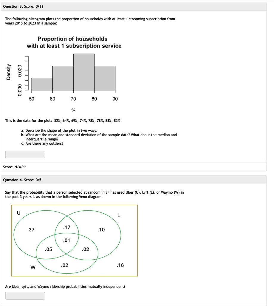
The following histogram plots the proportion of households with at least 1 streaming subscription from
years 2015 to 2023 in a sample:
Proportion of households
with at least 1 subscription service
Density
0.000
0.020
50
60
70
80
90
%
This is the data for the plot: 52%, 64%, 69%, 74%, 78%, 78%, 83%, 83%
a. Describe the shape of the plot in two ways.
b. What are the mean and standard deviation of the sample data? What about the median and
interquartile range?
c. Are there any outliers?
Score: N/A/11
Question 4. Score: 0/5
Say that the probability that a person selected at random in SF has used Uber (U), Lyft (L), or Waymo (W) in
the past 3 years is as shown in the following Venn diagram:
U
.37
.17
.10
.01
.05
.02
.02
W
L
.16
Are Uber, Lyft, and Waymo ridership probabilities mutually independent?